Designed and developed a personalized homepage framework from the ground up for a global education institution, introducing clear categorization, tailored recommendations, and a streamlined registration process. Independently created the initial drafts to the headquarters, then collaborated with other designers to produce the first version. Delivered high-fidelity prototypes to ensure usability and scalability, enhancing course discovery and summer camp enrollment experiences.
The existing website lacked support for personalized designs tailored to individual branches, making it difficult to cater to the unique needs of different locations. Additionally, the overwhelming number of courses and camps made it challenging for users to find programs suitable for their children. The complex registration process further hindered user engagement, resulting in frustration and higher drop-off rates.
We redesigned the homepage to support branch-specific personalization, providing more relevant course and camp recommendations. The course discovery was improved with clearer categorization. The registration process was streamlined to reduce steps and enhance user flow. Mobile optimization was also enhanced for better accessibility.
Enabled each branch to have its own customized website for tailored promotions and localized content. Ensuring consistency with institutional branding while catering to specific audience needs. This enhanced user engagement and streamlined communication for individual branches.
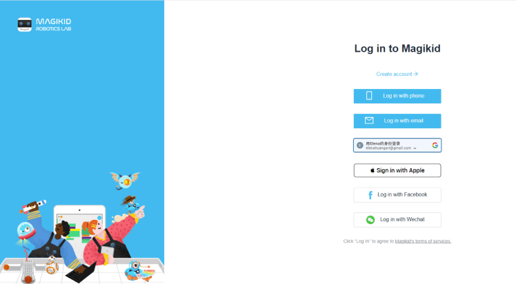
Addressed user frustrations with the original website's mandatory account registration, which was often cumbersome and led to high abandonment rates. The new design allows users to register for courses without creating an account, with staff assistance available for account setup if needed. This streamlined approach reduced barriers, improved user satisfaction, and ensured users could easily continue exploring courses after registration.
This project highlighted the importance of understanding user frustrations and designing solutions that prioritize their needs. By addressing key pain points, such as simplifying registration and introducing branch-specific personalization, we created a more user-friendly and scalable platform. One major learning was the value of iterative design; feedback from each phase helped refine the product to better align with user expectations. In future projects, I aim to further explore integrating real-time feedback mechanisms to enhance responsiveness and engagement.
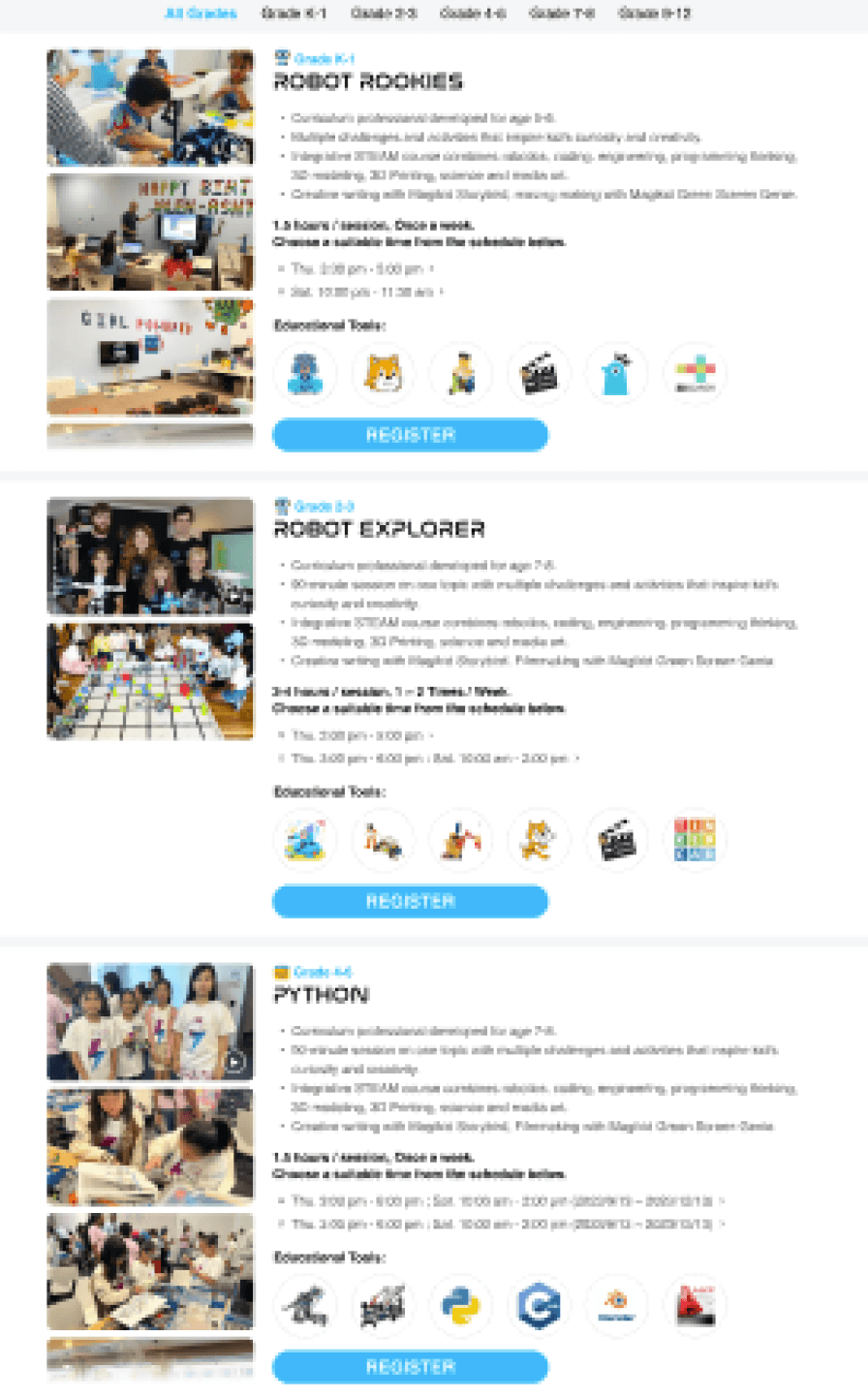
Implemented a branch-specific interface where users first select their preferred location. This ensures that subsequent course options are tailored to the selected branch, making navigation simpler and eliminating the frustration of discovering unavailable courses. Additionally, clearer and more intuitive categorization further streamlined the course selection process.
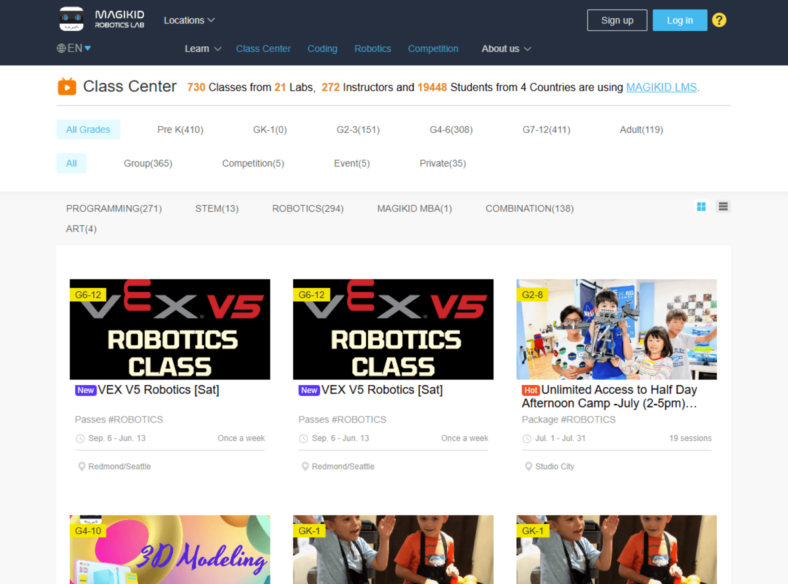
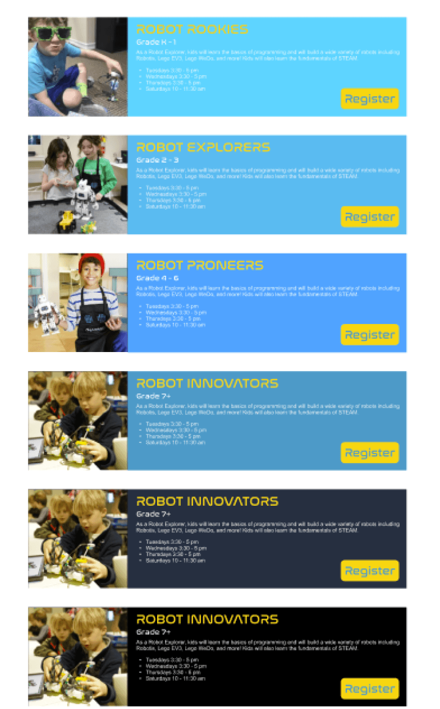
Building on the first version, we enhanced the course pages by adding detailed descriptions and schedules for each program. This improvement provided parents with the necessary information to make informed decisions and further streamlined the course selection process.
The website’s generic design failed to address the unique needs of individual branches, leading to a disconnect between users and their local offerings.
The vast array of courses and camps overwhelmed users, making it hard to identify programs suitable for their children.
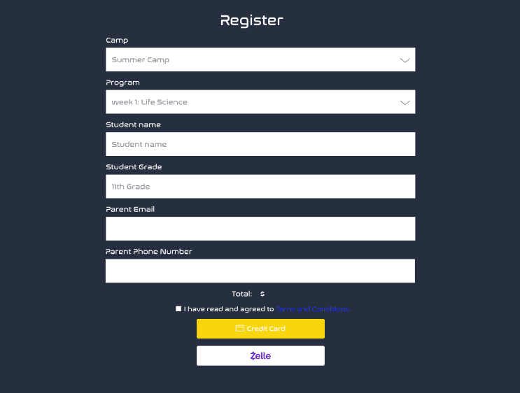
The multi-step registration process was confusing and time-consuming, causing frustration and increasing the likelihood of users abandoning the process.
The website’s design did not provide a seamless experience on mobile devices, increasingly used by parents for browsing and registration.
Magikid Robotic Lab Redesign
Collaboration
Education-Focused
Multi-Platform
Client
Magikid Robotic Lab
Role
UIUX Designer
Tools
Figma
Key Accomplishments
Problem
Reflection
My Contribution
Solution
First Draft
Original Website
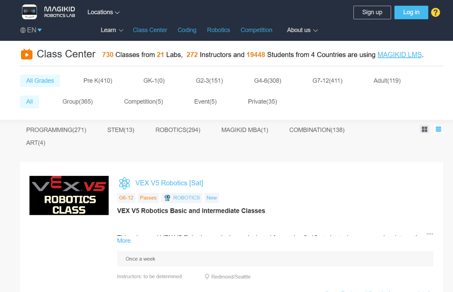
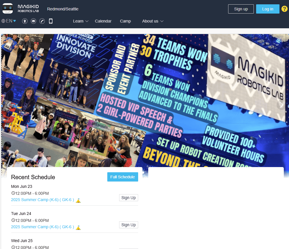
The original website lacked customization for individual branches, leading to confusion when courses available at one location were not offered at another. The overwhelming number of courses, combined with the absence of guidance or recommendations, made it difficult for users to navigate and select appropriate options. Additionally, users often discovered that courses they found were unavailable at their preferred location, resulting in frustration. The lack of featured or highlighted courses further reduced engagement by failing to draw attention to key offerings.
Original Website
Course Searching
Registration process
Home Page
Final Design
Final Design
First Draft
User Pain Points
Simplified the course discovery workflow, enabling users to find relevant programs with greater ease and efficiency.
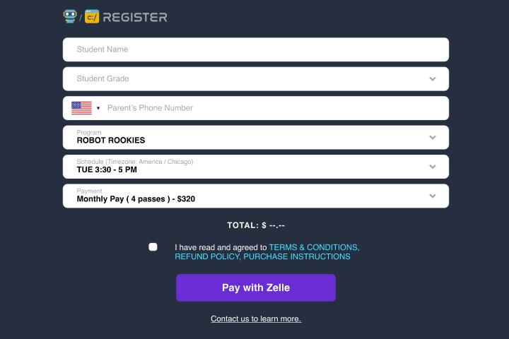
Streamlined the registration process, leading to a measurable increase in course enrollment rates.
Conducted user research to uncover pain points, identify user needs, and define project goals, leading to the development of targeted design solutions.
Lack of personalization
Difficulty in course discovery
Complex
registration process
Limited
mobile optimization
Created initial UX/UI design drafts and collaborated on the first version of the homepage, ensuring usability and alignment with user needs.
Enhanced the homepage’s personalization algorithm, delivering tailored course and camp recommendations, which increased user engagement and time spent on the platform.


Designed and developed a personalized homepage framework from the ground up for a global education institution, introducing clear categorization, tailored recommendations, and a streamlined registration process. Independently created the initial drafts to the headquarters, then collaborated with other designers to produce the first version. Delivered high-fidelity prototypes to ensure usability and scalability, enhancing course discovery and summer camp enrollment experiences.
Implemented a branch-specific interface where users first select their preferred location. This ensures that subsequent course options are tailored to the selected branch, making navigation simpler and eliminating the frustration of discovering unavailable courses. Additionally, clearer and more intuitive categorization further streamlined the course selection process.
Building on the first version, we enhanced the course pages by adding detailed descriptions and schedules for each program. This improvement provided parents with the necessary information to make informed decisions and further streamlined the course selection process.
The website’s design did not provide a seamless experience on mobile devices, increasingly used by parents for browsing and registration.
Magikid Robotic Lab Redesign
Collaboration
Education-Focused
Multi-Platform
Client
Magikid Robotic Lab
Role
UIUX Designer
Tools
Figma
Key Accomplishments
Problem
Reflection
My Contribution
Solution
First Draft
Original Website
Course Searching
Registration process
Home Page
Final Design
Final Design
First Draft
User Pain Points
Simplified the course discovery workflow, enabling users to find relevant programs with greater ease and efficiency.
Streamlined the registration process, leading to a measurable increase in course enrollment rates.
Conducted user research to uncover pain points, identify user needs, and define project goals, leading to the development of targeted design solutions.
Lack of personalization
Difficulty in course discovery
Limited
mobile optimization
Created initial UX/UI design drafts and collaborated on the first version of the homepage, ensuring usability and alignment with user needs.
Enhanced the homepage’s personalization algorithm, delivering tailored course and camp recommendations, which increased user engagement and time spent on the platform.
This project highlighted the importance of understanding user frustrations and designing solutions that prioritize their needs. By addressing key pain points, such as simplifying registration and introducing branch-specific personalization, we created a more user-friendly and scalable platform. One major learning was the value of iterative design; feedback from each phase helped refine the product to better align with user expectations. In future projects, I aim to further explore integrating real-time feedback mechanisms to enhance responsiveness and engagement.
Addressed user frustrations with the original website's mandatory account registration, which was often cumbersome and led to high abandonment rates. The new design allows users to register for courses without creating an account, with staff assistance available for account setup if needed. This streamlined approach reduced barriers, improved user satisfaction, and ensured users could easily continue exploring courses after registration.
The existing website lacked support for personalized designs tailored to individual branches, making it difficult to cater to the unique needs of different locations. Additionally, the overwhelming number of courses and camps made it challenging for users to find programs suitable for their children. The complex registration process further hindered user engagement, resulting in frustration and higher drop-off rates.
The website’s generic design failed to address the unique needs of individual branches, leading to a disconnect between users and their local offerings.
Complex registration process
The multi-step registration process was confusing and time-consuming, causing frustration and increasing the likelihood of users abandoning the process.
Original Website
The vast array of courses and camps overwhelmed users, making it hard to identify programs suitable for their children.
We redesigned the homepage to support branch-specific personalization, providing more relevant course and camp recommendations. The course discovery was improved with clearer categorization. The registration process was streamlined to reduce steps and enhance user flow. Mobile optimization was also enhanced for better accessibility.
Enabled each branch to have its own customized website for tailored promotions and localized content. Ensuring consistency with institutional branding while catering to specific audience needs. This enhanced user engagement and streamlined communication for individual branches.
The original website lacked customization for individual branches, leading to confusion when courses available at one location were not offered at another. The overwhelming number of courses, combined with the absence of guidance or recommendations, made it difficult for users to navigate and select appropriate options. Additionally, users often discovered that courses they found were unavailable at their preferred location, resulting in frustration. The lack of featured or highlighted courses further reduced engagement by failing to draw attention to key offerings.